
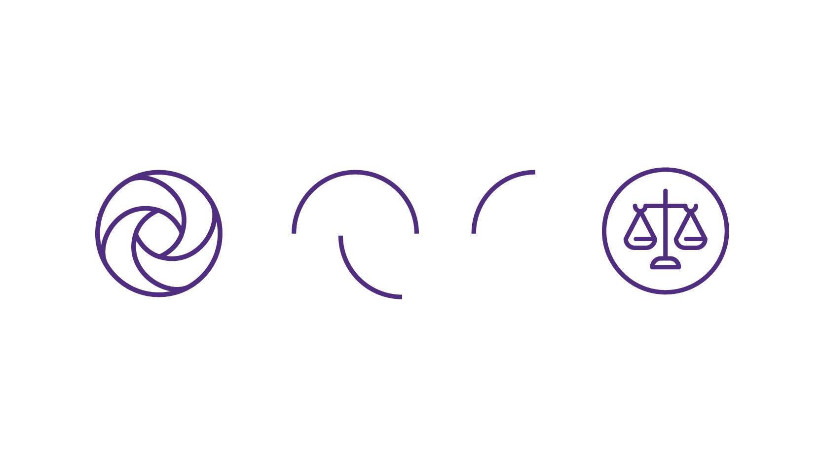
Iconography
The iconography style originates in the outline version of our Mobius. This shape informs icons’ interior proportions and line weight. These simplified forms improve scalability and clarity of meaning, while the interior spacing promotes legibility. The rounded edges and end caps enhance the icons approachability and connection to the Mobius.
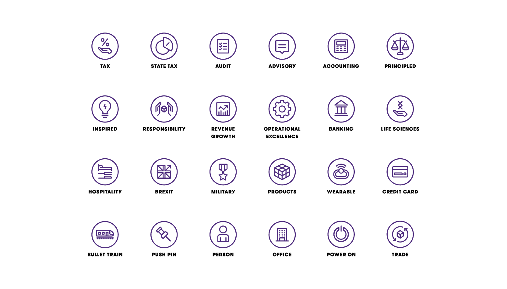
Subject matter
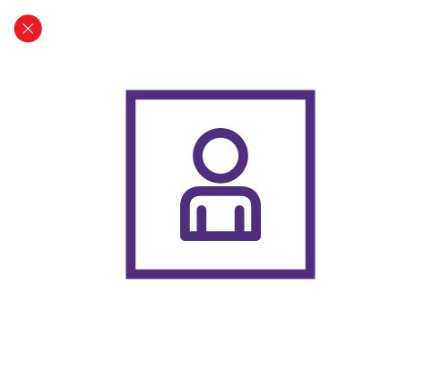
Iconography is figurative, functional and informative, conveying ideas rather than abstract, illustrated forms. Icons can have multiple meanings for use in different contexts. For example, a ship may denote that specific, tangible object (a ship to represent a ship), or it may express broader topics with simple, visual metaphors (a ship to represent maritime trade). All icons are available through Brand Central..
Color use
Icons can be used in the following colorways.

Solid color

Gradient color
Solid color
The icons are available in all core, primary and secondary colors. Only use the color combination seen below to maintain legibility.

Gradient color
We can recolor icons to gradient color for greater impact in communications. This treatment should be used sparingly and follow the gradient combinations and combinations outlined in the color section. Only use the color combination seen below to maintain legibility.


Spacing detail
An icon’s original bounding circle dictates how far icons should be spaced within an isotype chart.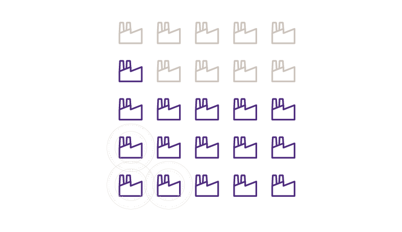
Isotype chart
Use isotypes for percentage charts, not as bar charts.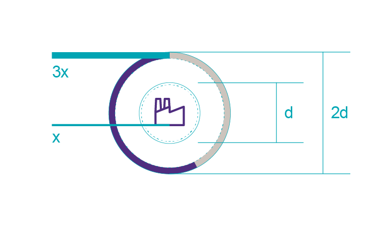
Hollow pie chart
In hollow pie charts, the diameter of the chart circle is 2x that of the icon’s bounding circle. The chart’s stroke weight is 3x that of the icon’s stroke.Fill icon color.

Fill rounded circle

Edit solid colors
Edit rounded circle
Combine icons to form illustration