Our photography
Photography brings warmth and builds an emotional connection to our people, relationships, clients, communities and Go Beyond.

Photography principles
To make sure our photography is on brand, we use three basic principles when sourcing imagery from stock libraries or when commissioning a photoshoot. To assist with tonal adjustments, you can download our Photoshop action scripts below.

Natural
Imagery is not over-saturated. Color is toned-back, realistic and human.
Warm
The overall color of imagery is warm, not cool. Warm tones are more positive and relatable.
Even
Tones of imagery are neither highly contrasted nor washed out. Photography should have an even balance of light levels.Subject matter
It is important our photography captures the essence of the people we encounter, from employees to clients and beyond. Follow the examples below to help convey the broader, human qualities of our brand and the communities we serve.

Core

Industry

Go Beyond
Core
Our core brand photography features people candidly interacting in a workplace environment. These images capture the essence of people we encounter, from employees to clients and beyond.

Industry
Our industry photography represents our diverse set of clients, the extent of industries we work with and our valued expertise in different industries.

Go Beyond
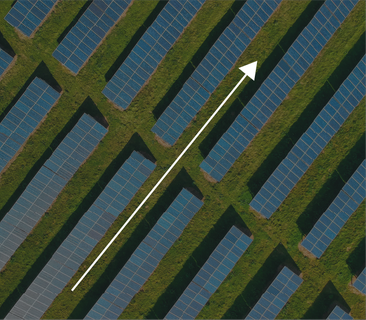
Our ‘Go Beyond’ category includes a variety of images either aspirational or industry related all with a common sense of direction. These images should not be people focused.

Go Beyond principles
Images should feel aspirational and have a sense of direction. Direction angle can vary depending on the image as shown below:

1. From left to right

2. Diagonally from the bottom left to the top right

3. Forward, from bottom to top
Photography improper use
When sourcing or commissioning photography, we should avoid the examples seen below

When featuring people, images should feel candid and natural. Subjects should not appear to be posing.

Duotone and color effects applied.

Poor crop, cutting off subjects and the focus of an image.
Messaging

© 2025 Grant Thornton
Last updated: May 2025
Any questions?
Please contact: dane.contor@us.gt.com
