Visual system
Our Visual system is a collection of elements and approaches that make sure our brand is cohesive and meaningful.
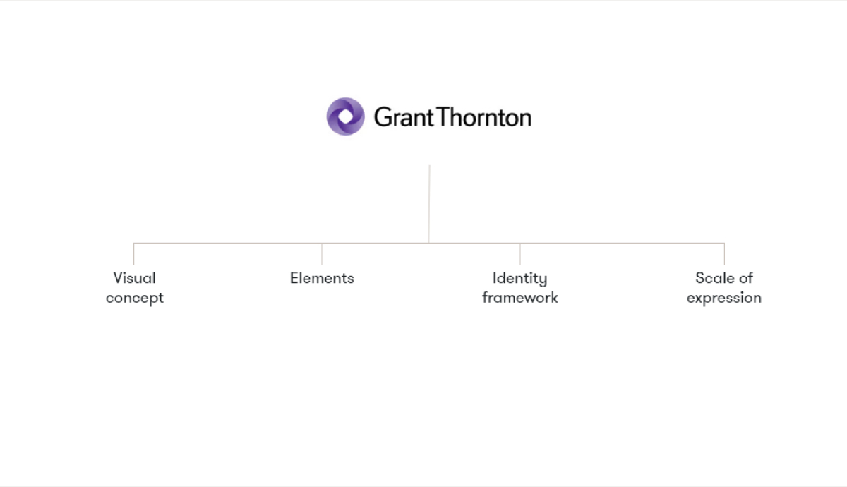
Our visual concept:
Our expanding impact
Our visual concept is what drives our identity and reflects what Grant Thornton stands for as an organisation. Going beyond business as usual allows us to create an ever-expanding impact for our people, clients and communities. This ripple effect enables us to positively shape our tomorrow, leading the way in sustainable growth and purpose.
Elements in our system
Our visual identity is made up of eight key parts that will ensure our brand is unique and identifiable.
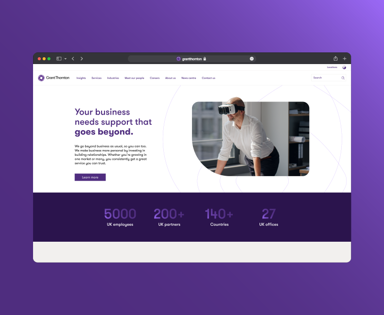
Logo

Color
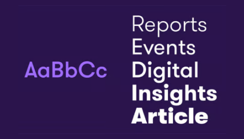
Typography

Photography
Grid & layout

Graphic textures

Photography treatment
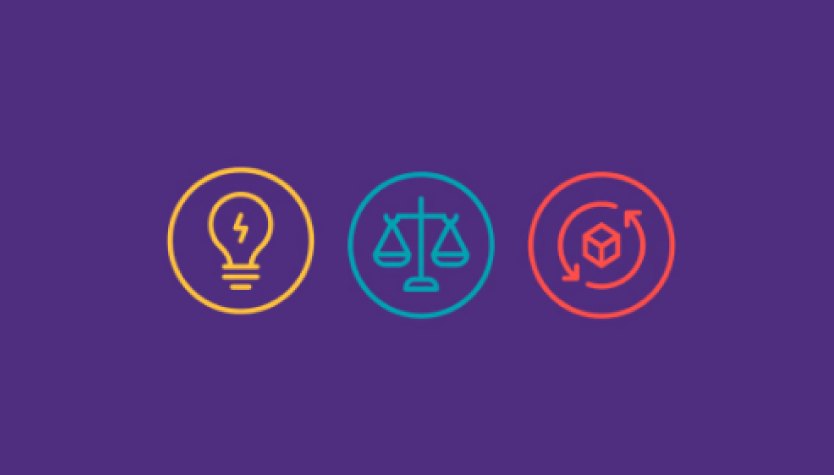
Iconography
Identity framework
Our brand system is core and creative. Within core we have fixed and flexible elements, enabling our brand to be used in multiple ways to showcase our services. This creates cohesion across our portfolio, with all extensions of the corporate identity sitting within this system. Creative is how our identity can flex over time to cater for new audiences and business needs.
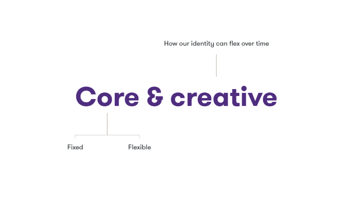
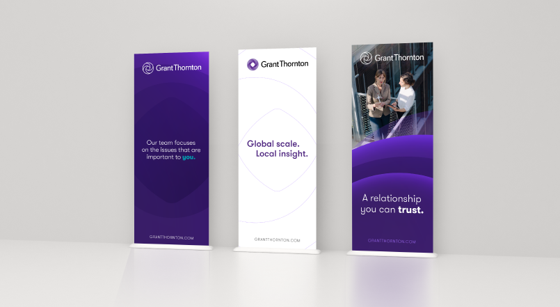
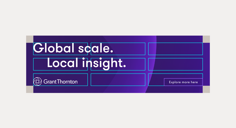
Core: Fixed
The elements that will always be presented in consistent ways across communications to help drive cohesion across the entire identity.
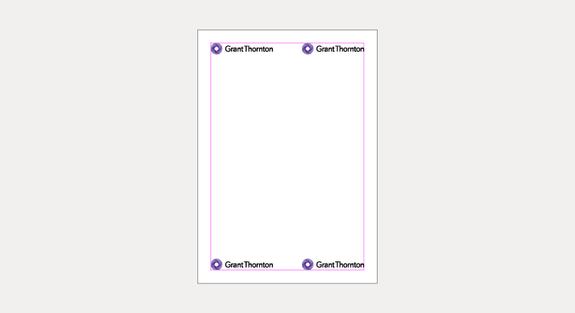
Logo
Consistent logo placement.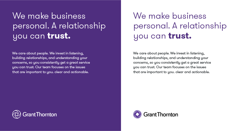
Core Purple & Core White
Communications rooted in either Core Purple or Core White.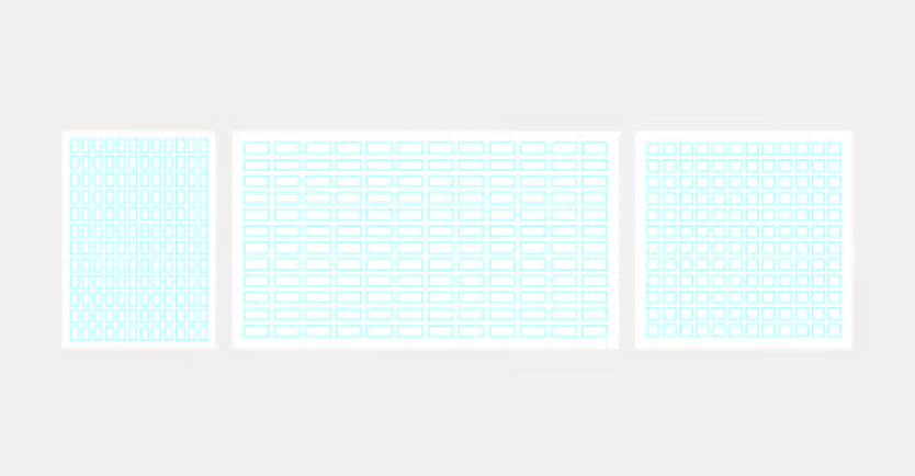
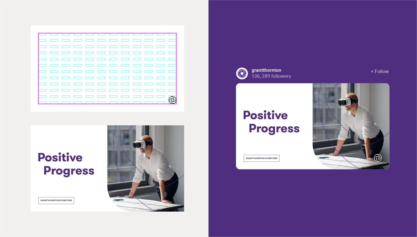
12x12 grid
Grid for consistency and scalability in print and digital.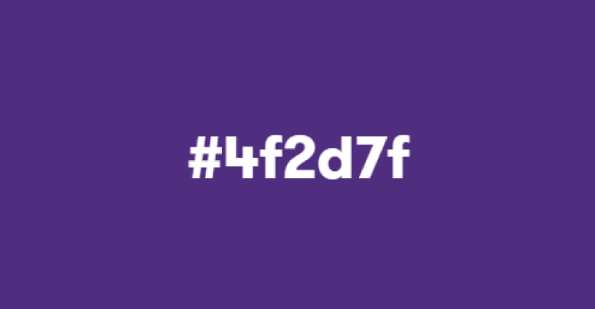
Color values
Color values are fixed assets and should not be altered in any way.Core: Flexible
The assets with flexibility. Allowing us to tailor and suit the audience and communication need.
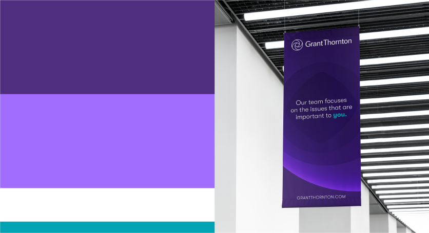
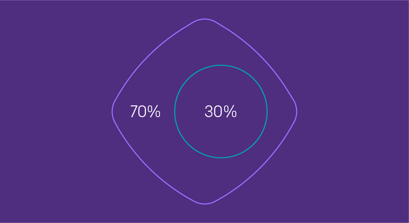
Color ratios
We can combine colors in different ways, giving us flexibility to create varied experiences.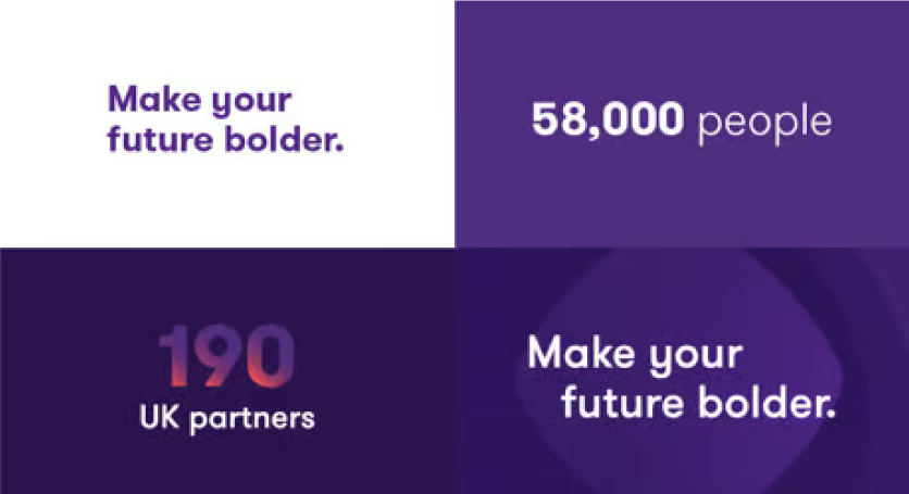
Typographic styles
We can express our typographic system in four separate ways.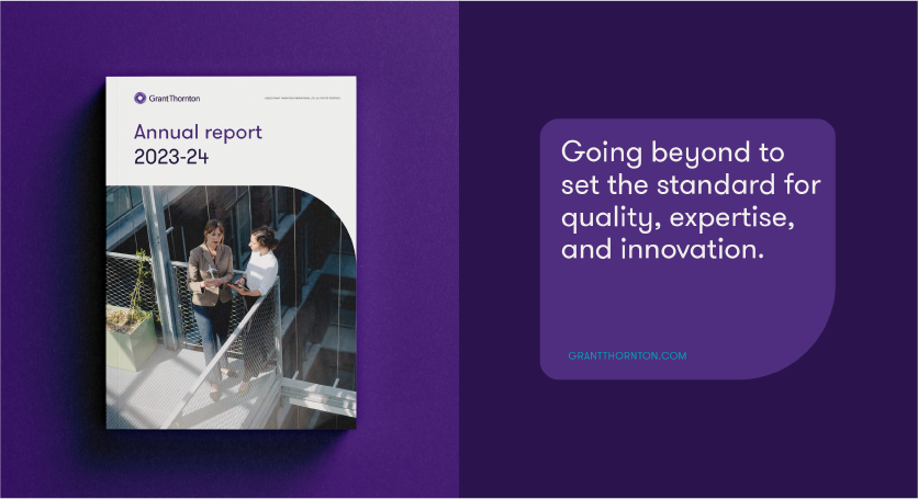
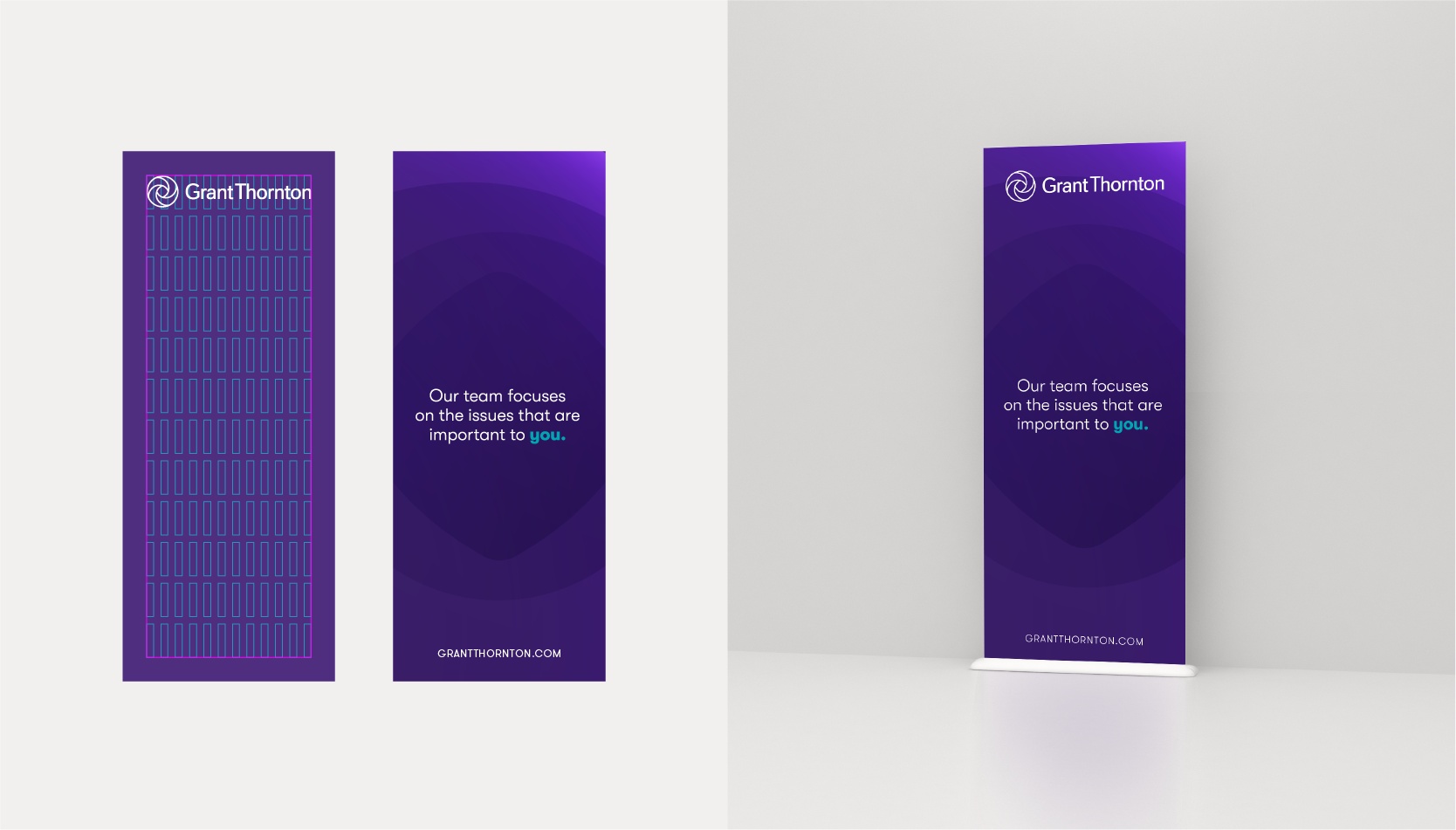
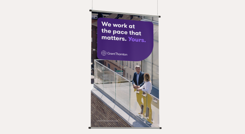
Holding shape styles
We have two approaches to our layout system: holding shape and cropped holding shape.
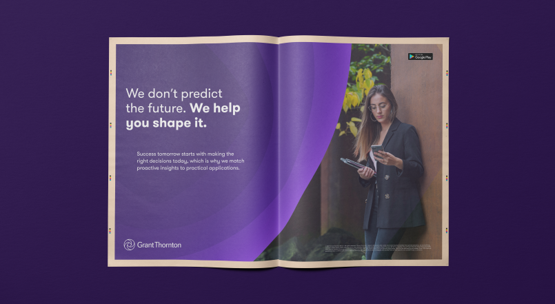
Graphic textures
We can use three different variations of graphic textures
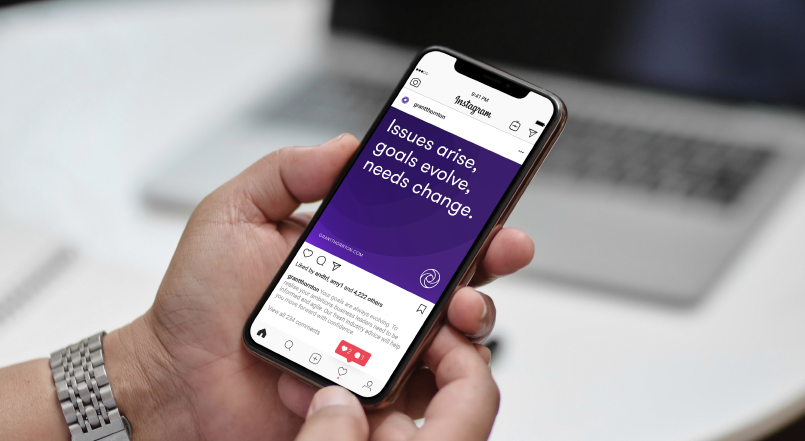
Photography styles
We can convey the broader, human qualities of our brand and the communities we serve through photography styles.
Photography treatments
Three photography treatments to support content, help create interest and allow the brand to easily own imagery.
Iconography styles
Two color approaches to iconography.Fixed & flexible in practice
Creative
Creative is how our identity can flex over time to cater for new audiences and business needs. The examples below are indicative of how certain elements can evolve and be used for campaigns or spatial design. These should not be recreated without permission from gtimarketing@gti.gt.com

UI inspired by holding shape
Data graphics

Holding shape and cut-out imagery

Spatial dimensional textures
Scale of expression
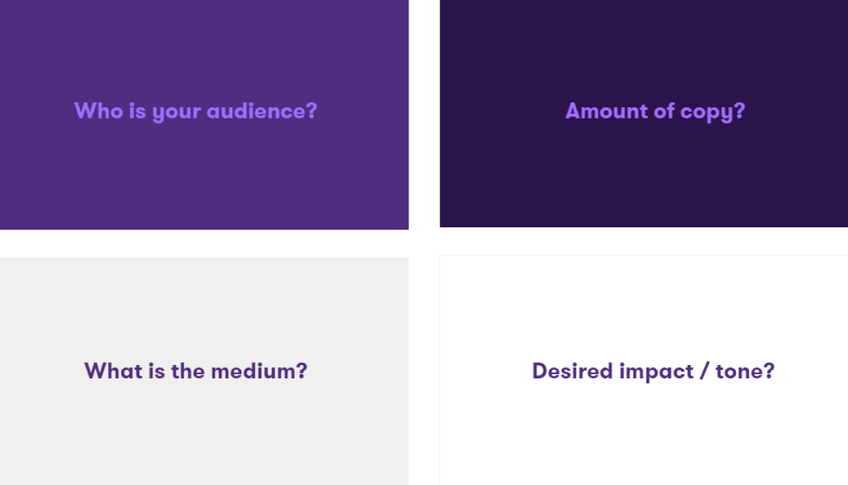
The brand has a range that allows us to dial the expression up and down according to our communication needs. Before creating branded collateral we must consider tone, audience and format when selecting the most appropriate brand elements. Below are a selection of thought starters to help you plot communications on the expression scale.
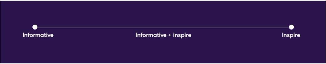
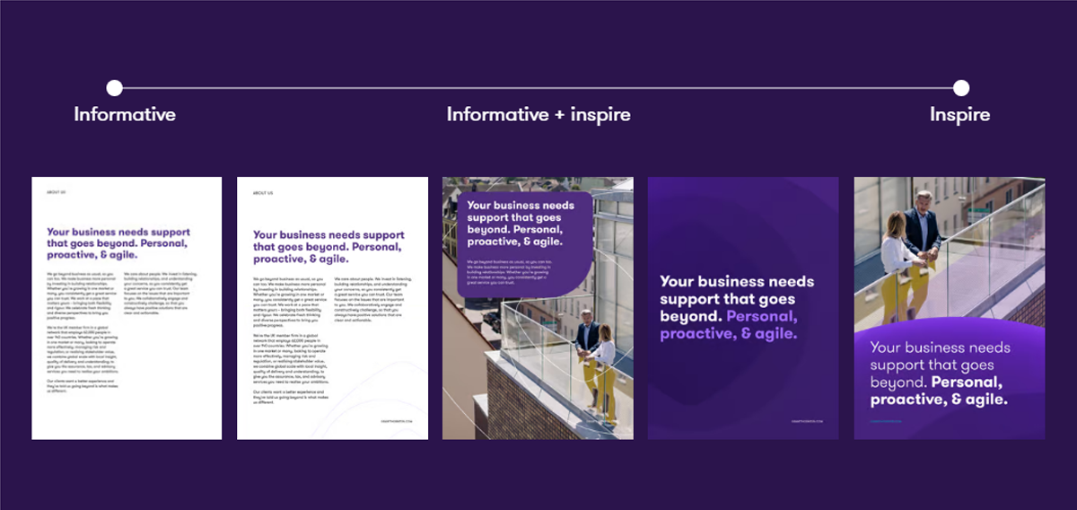
Informative
Content heavy / need to be legible / functional / accessible
Informative + inspiring
Mid-way / can inspire but also communicate key information
Inspiring
Mainly contain short headlines + flexible brand assets