
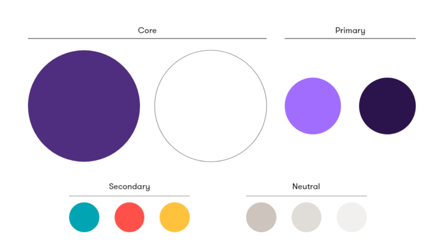
Our Color
Our color palette consists of four groupings: Core, primary, secondary and neutral. Our core colors make sure every communication is clearly Grant Thornton and provides the foundation for our brand. Primary colors provide vibrant brand recognition and are contemporary in tone. Secondary colors add expression, warmth and flexibility. Neutral colors create soft and clean backgrounds in digital and print.
Color usage
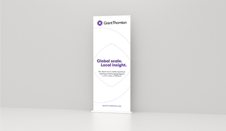
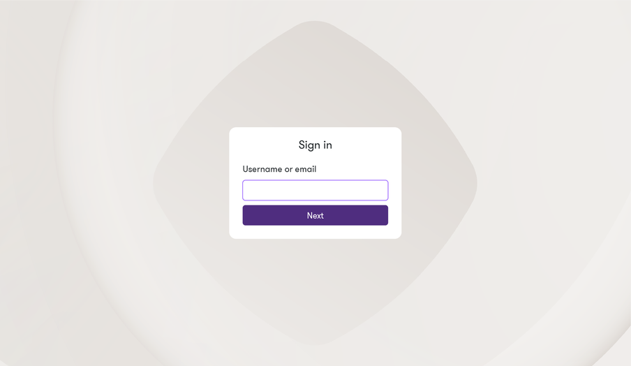
Core Purple and Core White are our main brand colors and provide the dominant color impression overall. Secondary colors support to provide warmth and distinction. The example below gives an indication of how our overall brand color should appear on a whole.


Core palette
Our core palette brings recognition and familiarity to our brand. Below are the exact values of each color. For consistency in our brand, these values must be applied across all our communications and designs.
Core White
HEX #ffffffRGB 255 255 255
CMYK 0 0 0 0
Core Purple
HEX #4f2d7fRGB 79 45 127
CMYK 82 100 0 12
Pantone 268 C
RAL 310 30 40
Primary palette
Primary colors provide vibrant brand recognition and are contemporary in tone.
Dark Purple
HEX #2b144dRGB 43 20 77
CMYK 97 100 0 36 Pantone 274 C
RAL 310 20 30
Bright Purple
HEX #a06dffRGB 160 109 255
CMYK 58 64 0 0
Pantone 265 C
RAL 300 50 40
Core usage
Core White and Core Purple should be used on all brand assets to help maintain recognition.


Primary usage
We can combine core colors with Dark Purple and Bright Purple in different ways giving us flexibility to create varied experiences.


Secondary palette
Our secondary palette is used sparingly across brand assets such as textures, gradient backgrounds, graphs and typography.
Coral
HEX #ff5149RGB 255 81 73
CMYK 0 82 80 0
Pantone 7417 C
RAL 3024
Yellow
HEX #ffc23dRGB 255 194 61
CMYK 0 25 100 0
Pantone 7549 C
RAL 1021
Teal
HEX #00a4b3RGB 0 164 179
CMYK 81 0 22 0
Pantone 7711 C
RAL 210 60 40
Secondary palette usage
Secondary colors combine with our core and primary colors to add expression, warmth and flexibility. Below are examples of how we can dial up the combinations in various ways.


Neutrals
Within our palette we have a neutral greyscale palette which offers neutral backgrounds in digital and print.
Dark Grey
HEX #ccc4bdRGB 204 196 189
CMYK 20 18 22 2
Pantone Warm Grey 3 C
RAL 7032
Mid Grey
HEX #e0dcd7RGB 224 220 215
CMYK 6 7 9 12
Pantone Warm Grey 2 C
RAL 9002
Light Grey
HEX #f2f0eeRGB 242 240 238
CMYK 6 2 4 0
Pantone Warm Grey 1 C
RAL 9001
Neutrals usage
Follow the examples below for suitable usage of our neutral palette.


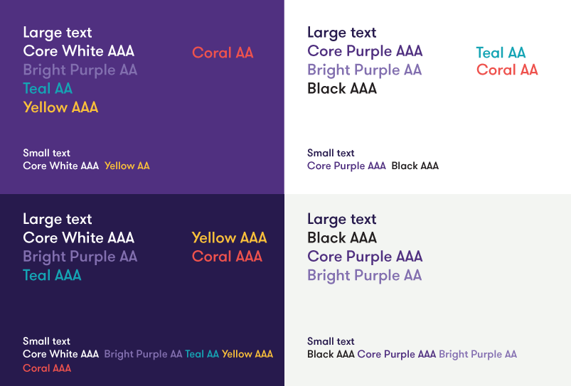
Color accessibility
It is crucial we maintain legibility within our brand communications and that our websites meet WCAG AA standards. Only use these color combinations when using text and color in our brand.
*To remain compliant, large text is defined as 14 point (typically 18.66px)
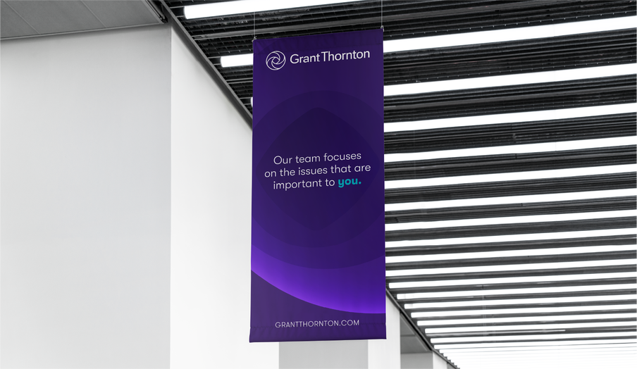
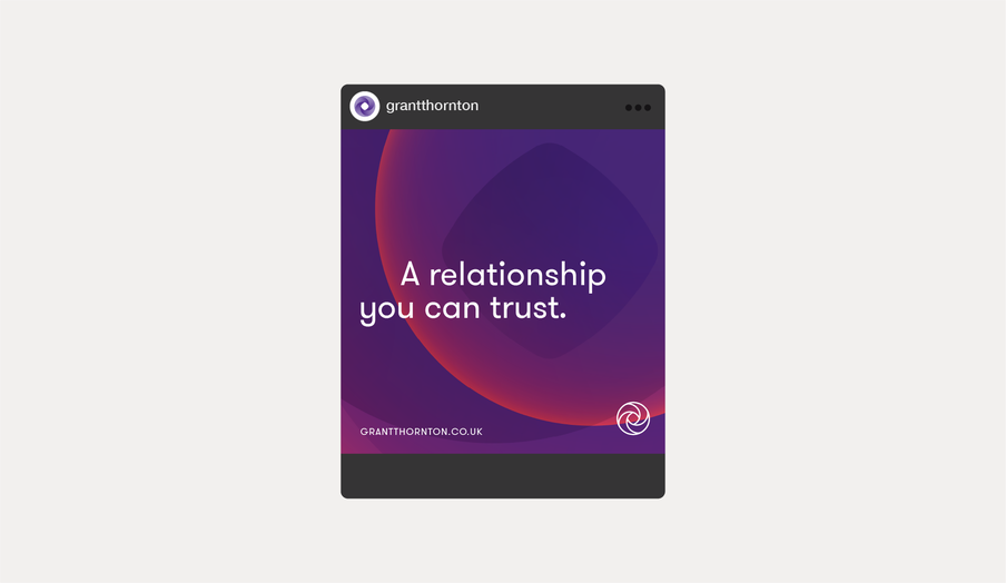
Gradients
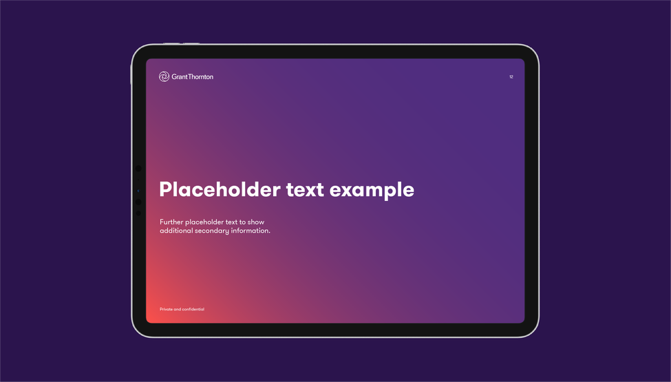
Across our material we can use gradient backgrounds – a transition from Core Purple to a primary or secondary color to add warmth and depth. Consider the use of gradients carefully, ensuring it is used solely for backgrounds and sparingly within our material.
*To remain compliant, large text is defined as 14 point (typically 18.66px)
Gradient construction
When constructing the gradient background, the prominent color should always be Core Purple with one addtional color. These gradients are always at a positioning of 45 degrees. Follow the examples below for construction and correct color combinations.
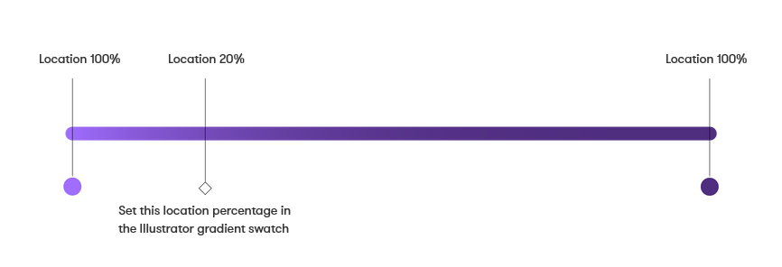
This diagram shows how the gradient has been created in Illustrator. This principle can be applied to any required recreation of the gradient in an Adobe application.


Digital text link color
To aid legibility in a digital space we have a single use digital text link color.
Refer to the digital guidelines for this specific usage of inline text links and CTAs by contacting Beth Woolveridge.


Digital color tints
To create depth and variation in web touchpoints we can use incremental tints of our color palette.
The tints should only be used in web or digital product applications for backgrounds and should not be used for any other purpose in the brand. If you are developing a digital application or microsite etc, refer to our global digital application or microsite etc, refer to our global digital guidelines for color tint references, avaliable through Beth Woolveridge, global digital director.