Our logo
With help from our grid and layout system we can create simple, clear and balanced layouts in our communications.
Symbol
The inspiration for the symbol is the Mobius strip. It is a continuous band that looks three dimensional and permanent yet flexible. Its interconnectedness represents us and our clients, and us and our people.
Wordmark
Our wordmark is clean and simple and increases legibility, making it ideal for onscreen, digital and advertising use.
Logo versions
The horizontal version is used on most occasions. The stacked version is only allowed in very exceptional circumstances.
Horizontal version
Centered version
Logo colorways
The logo is available in two colorways to accommodate both light and dark backgrounds. This is to maintain consistency and legibility throughout the brand.

Full color
To be used on white or light backgrounds.
Access our logo file format
Single color logo
Our logos are also available in single color positive and negative versions.
Negative logo
Maximum contrast should be achieved by using the negative logo on dark backgrounds.
Positive logo
The positive logo is an alternate for white or light backgrounds.Use cases
Follow the examples below for indication of when and where to use our logos.
Full color to be used across all communcations with white or light background

Negative logo to provide greater contrast on brand textures and dark backgrounds
Positive logo used to be complementary and less standout.

Negative logo used on photography
Best practice
In order to maintain clarity and consistency when using our logos, follow the rules outlined below.
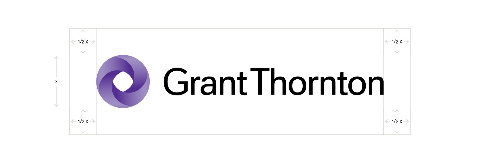
Logo clear space
To ensure brand impact and legibility, we have specified a clear space rule for logo usage.
Logo minimum sizes
To maintain legibility and brand integrity, we have outlined the miniumum sizes for our logo. The miniumum size is measured in height.
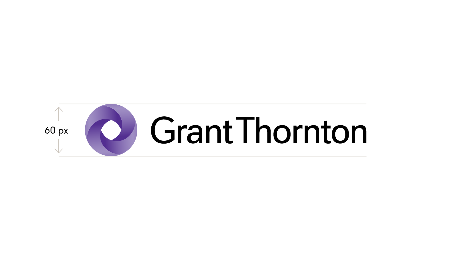
Digital 60 px
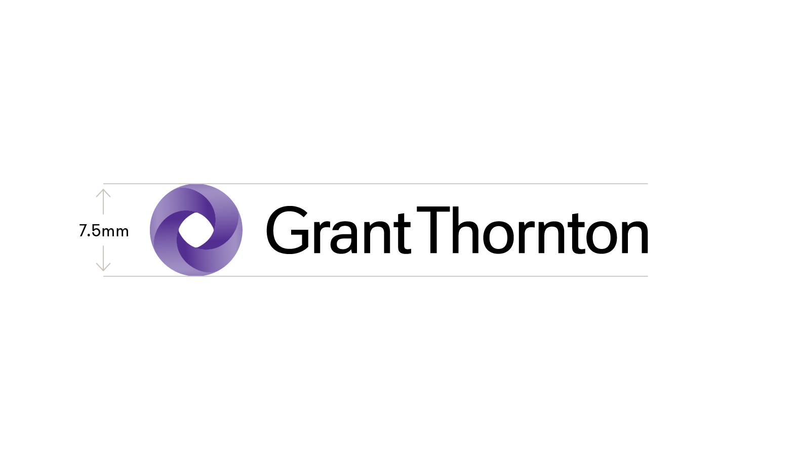
Print 7.55mm
Logo positioning
To ensure consistency and ease of implementation, our logos are always clearly positioned in the communication. Follow the examples below for best practice. Please refer to Grid and layout for correct logo scale and position in communications.
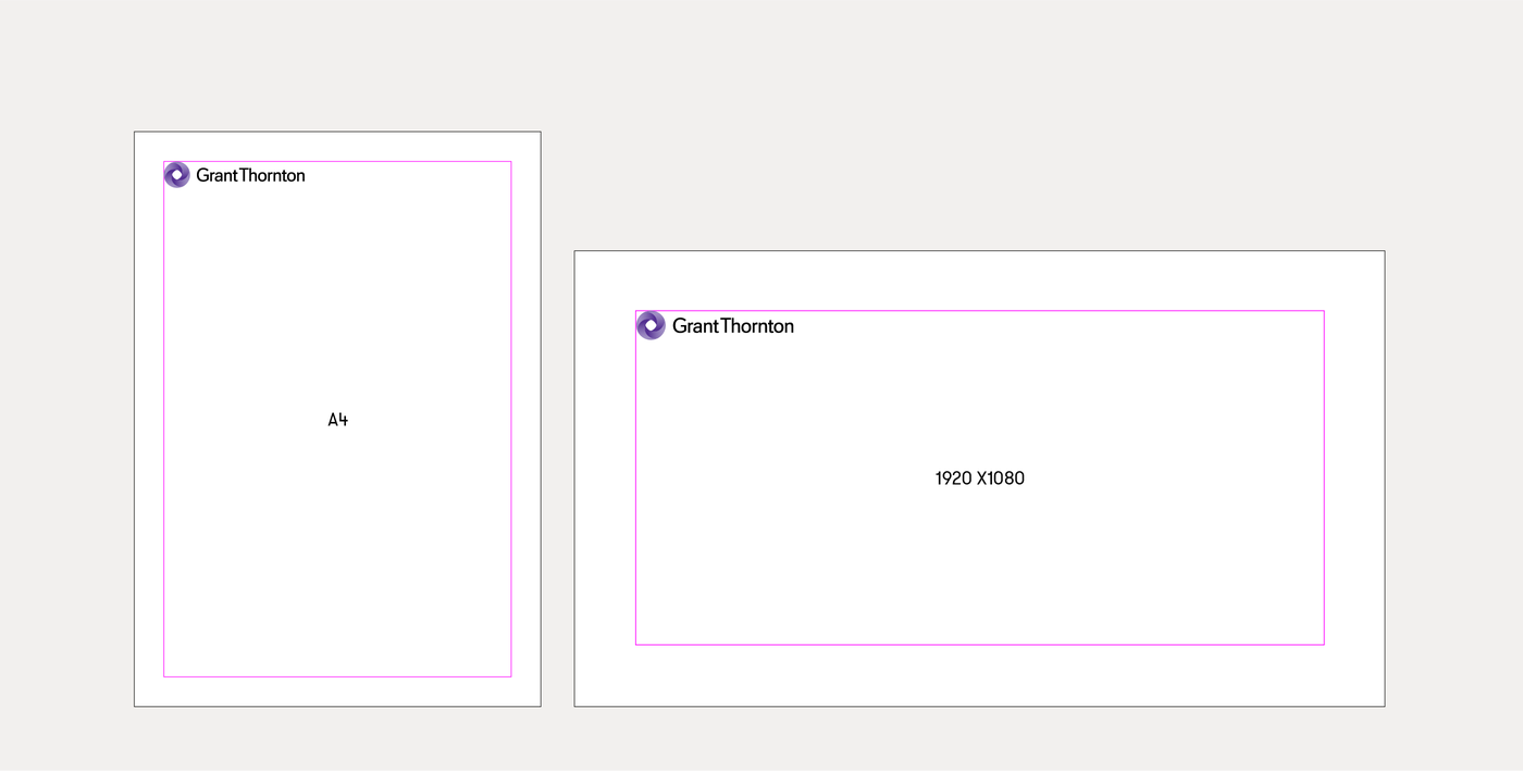
Primary positioning
In primary use-cases, the GT logo should always be positioned inside the top and left margins of a layout.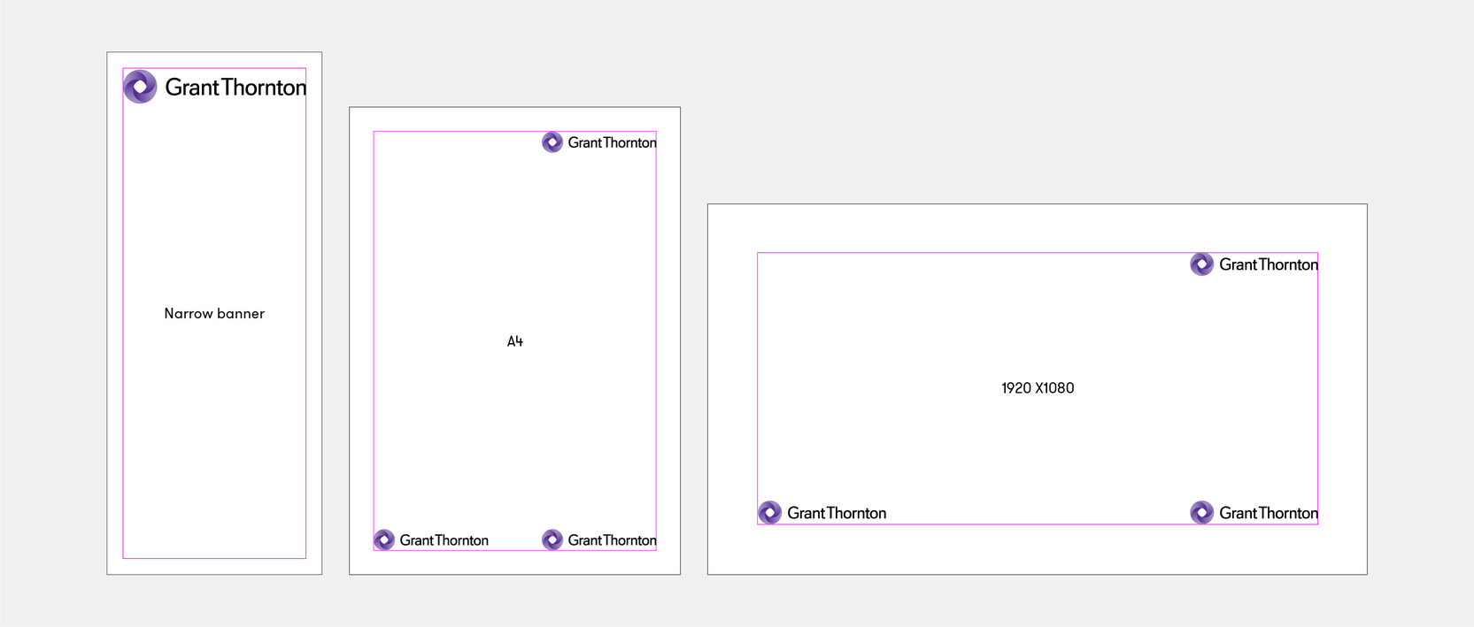
Secondary positioning
In instances where the logo cannot be positioned top left, the logo can be positioned bottom left, top right or centre aligned if a layout is too narrow.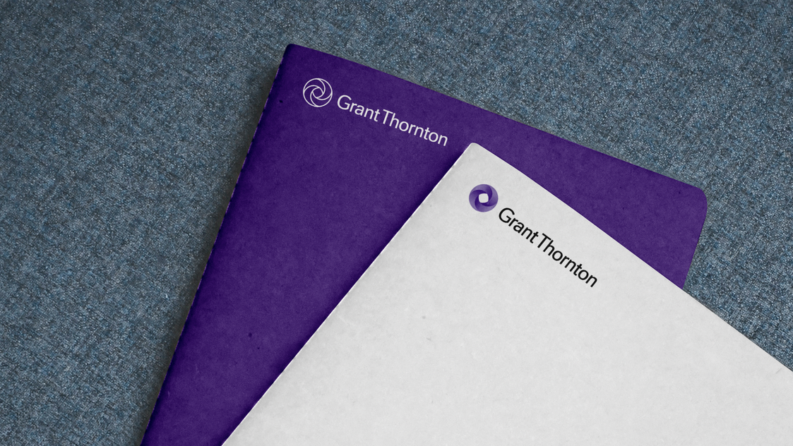
Improper use
Our logos are a fixed asset so please ensure you always use supplied artwork and treat them with care. Do NOT;
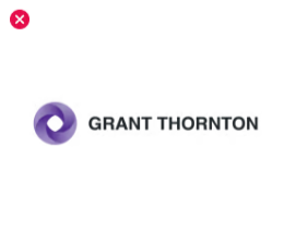
Recreate or redraw the logos
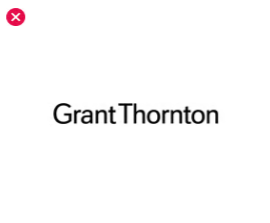
Use the wordmark on its own
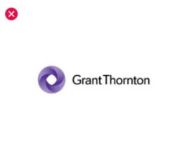
To be used on white or light backgrounds.
To be used on white or light backgrounds.
To be used on white or light backgrounds.
Mobius symbol
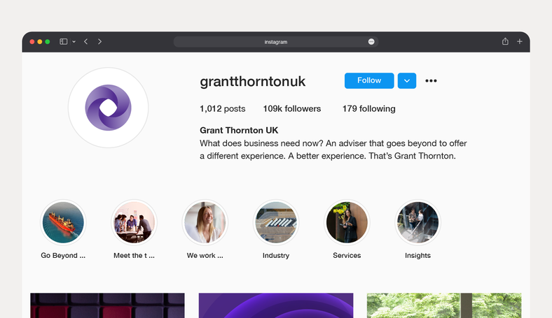
The Mobius symbol can be used on its own in some instances. Its primary function will be as a favicon, an app icon or a symbol online or where space is limited.
Symbol colorway
Our symbol is available in full color, positive and negative versions.
Digital example
To be used on white or light backgrounds.
Print example
To be used on white or light backgrounds.
Landscape
To be used on white or light backgrounds.Symbol use case
Digital example
Favicon, an app icon or a symbol online or where space is limited.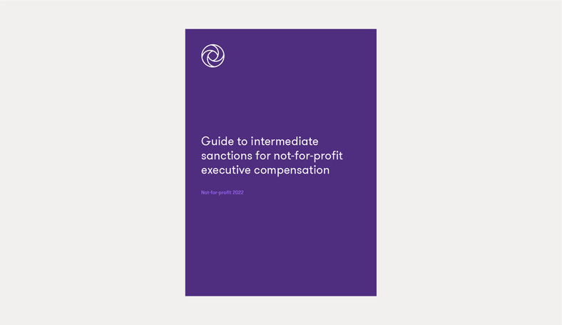
Print example
As a high-end stamp in print collateral.Animated logo
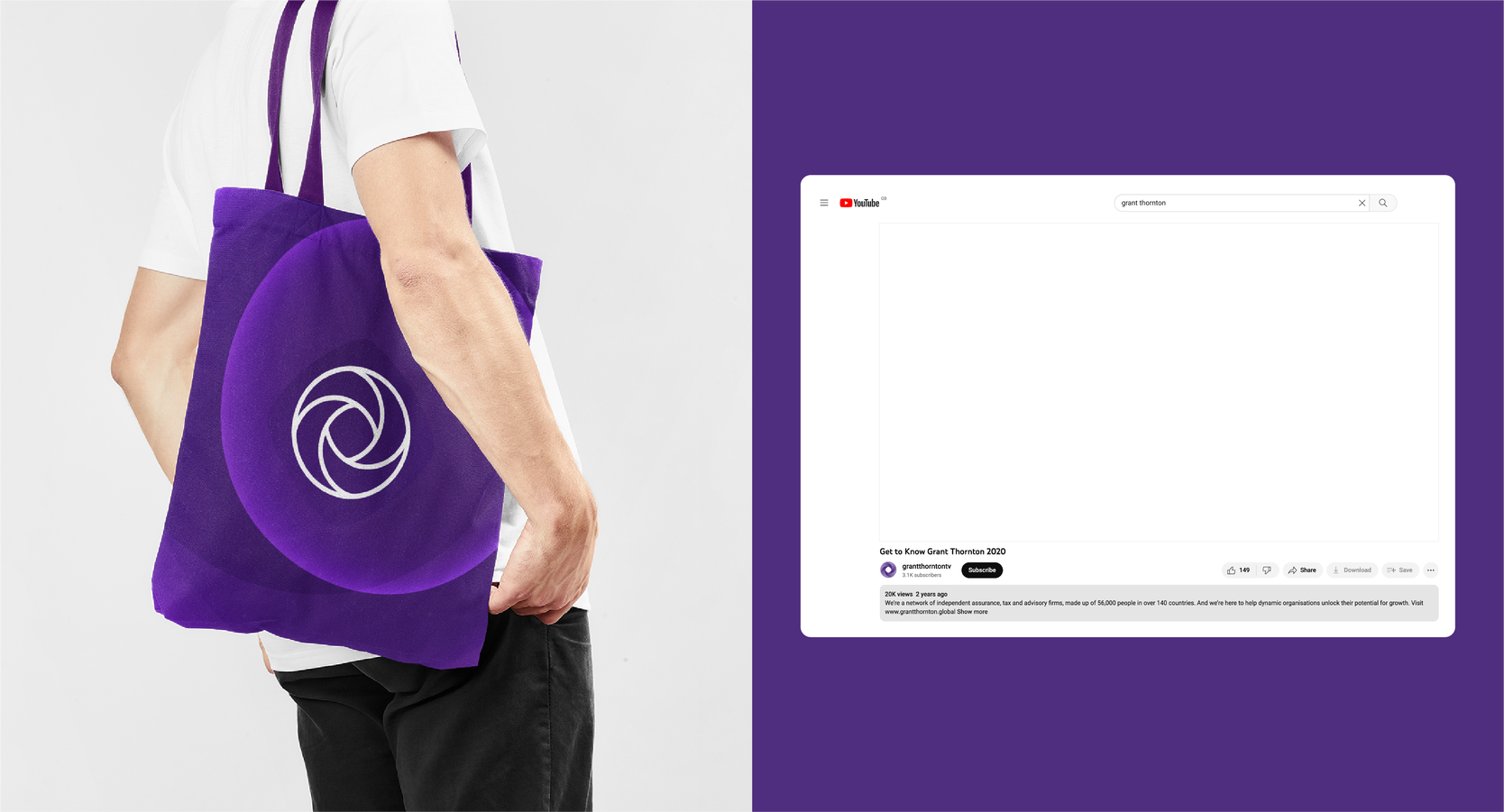
Our animated logo adds movement to our mobius strip and enhances the qualities of a three-dimensional yet static form. It should be used for hero moments in digital communications and video content.
Animated logo colorways
Full color
Positive logo on Core White
Core White on Core Purple
Core White on Primary Dark Purple
Example overview
© 2025 Grant Thornton
Last updated: May 2025
Any questions?
Please contact: dane.contor@us.gt.com
