
Our typography
Typography conveys our messages in a strong, consistent way, with a unique personality.

GT Walsheim
We use one font, GT Walsheim, to represent our brand. This font is clean, bold, direct and clear, and is a digital first typeface.
Download fonts from BrandCentral
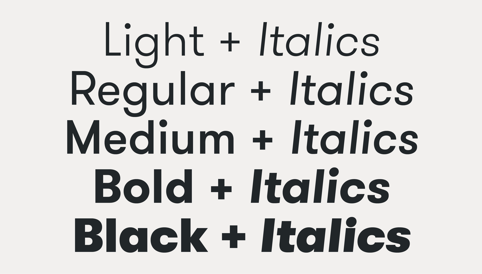
Weights
This font is available in a variety of weights and should be used across all digital and marketing applications. We use the weights shown below for headlines, titles, subheadings, body copy and quotes.
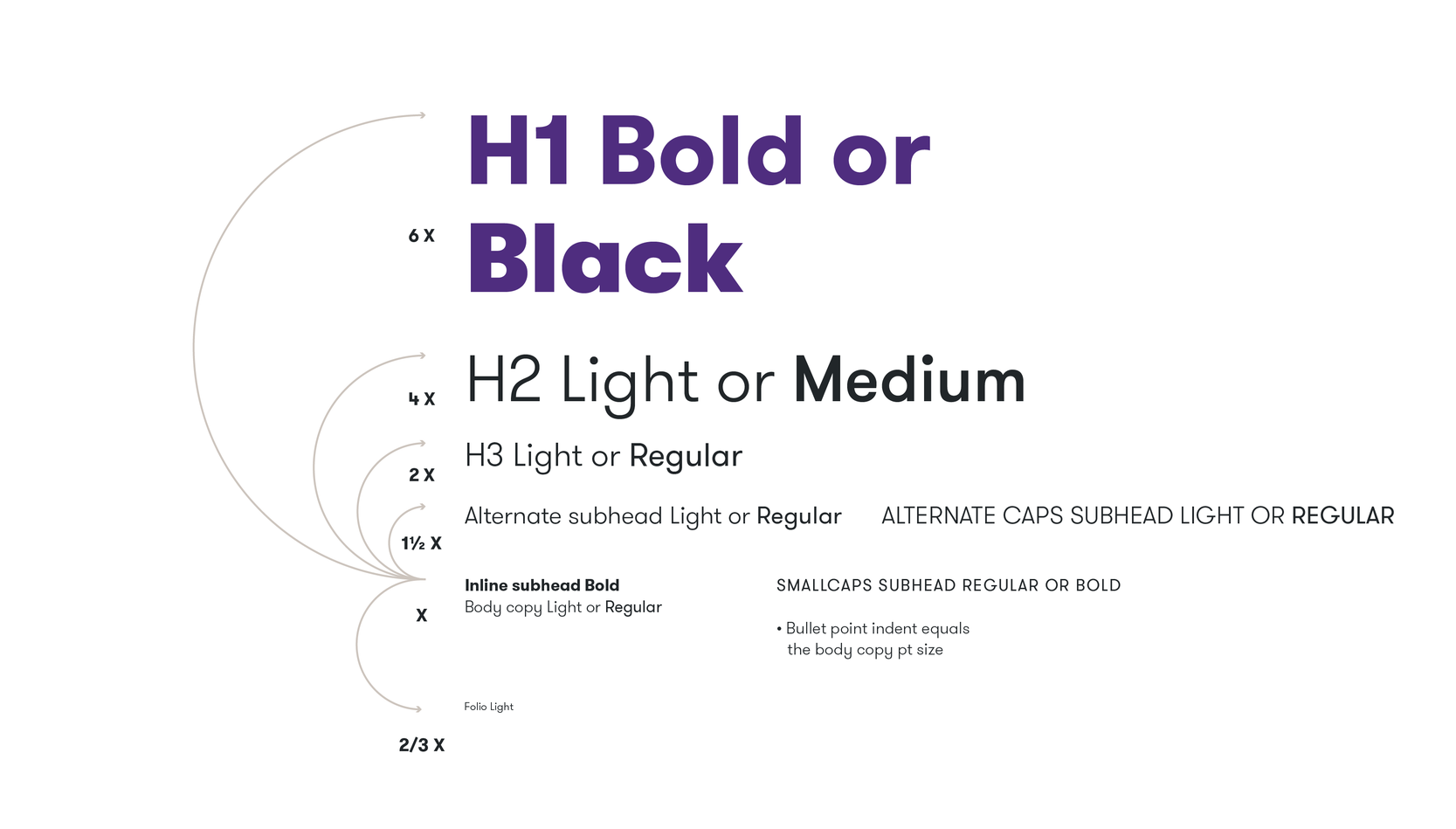
Hierarchy
We combine our typefaces and font weights to create a clear hierarchy and contrast within our typographic system. Not all headline levels need to be used in a single document/piece. Use a number of hierarchy levels that feel proportional and appropriate.
Best practice
We have defined clear typographic rules which make it easy to create layouts and typesetting.
Tracking & leading
To aid consistency and legibility follow the tracking and leading examples below.
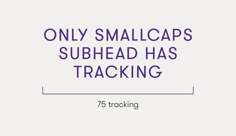
Tracking
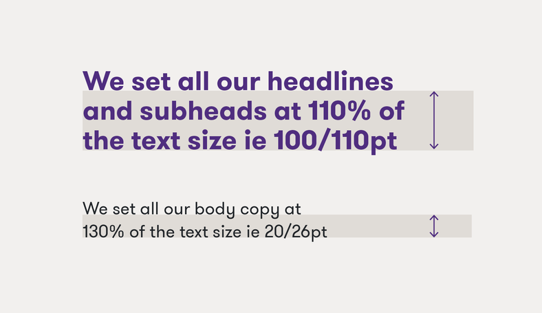
Leading
Alignment
We typeset our layout either left aligned or centre aligned.

Left aligned

Center aligned
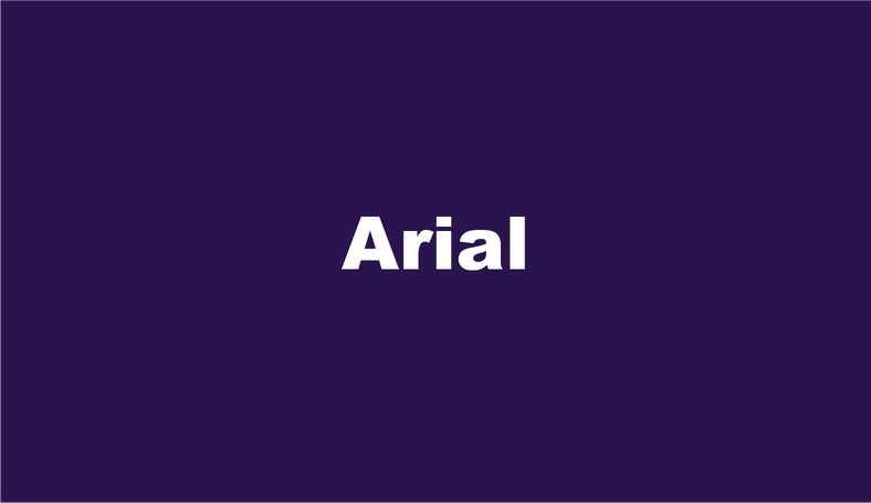
Fallback font
Our fallback font is Arial. It is used when our brand fonts are not available or cannot be used due to system or licensing limitations such as emails, Microsoft Office files or editable files shared with third parties.
Creating expression
We can express our typographic system in four separate ways. Standard, emphasis, highlight and indent expressions allow us to tailor our voice to particular messages and audiences.

Standard
Standard typography is our baseline in all communications and makes up a majority of our overall typographic expression. We combine our typefaces and font weights to create standard expressions, to be clear and concise with information.

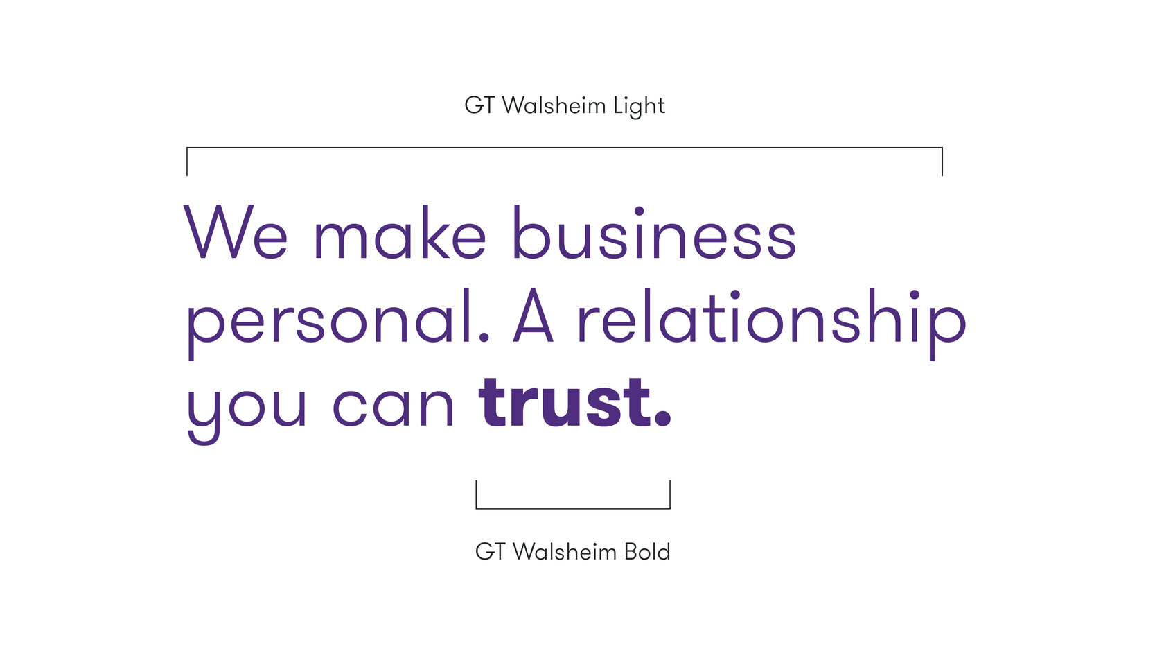
Emphasis
We can create emphasis in headlines level 2 & 3 by combining GT Walsheim Light and GT Walsheim Bold. This creates visual distinction and helps highlight important words or phrases.
Highlight
We use color and gradients with purpose to highlight words or phrases in headlines 1, 2 & 3. Refer to the color accessibility section of the guidelines for further color combinations.

Indents
We can create indents in our headlines and as standalone statements to create a sense of movement and motion.

Indent construction
Follow the steps below for best practice when creating indents in headline and hero statements.

Step 1:
For indent headlines, aim to create headlines over two lines with similar line width.

Step 2:
Offset the second line and aim to create balance by centre aligning the headline.
Example overview
