
Core guide
Core guide contains key information regarding each of our brand elements.
Strategy
Go Beyond is our global brand strategy. It encapsulates what we stand for, what differentiates us
and sits at the heart of our business, inspiring & influencing everything we do.
We go beyond business as usual to deliver a different experience. More personal, agile and proactive.
We challenge conventions to find better solutions. So our people, clients and communities can positively
shape tomorrow.

Logo
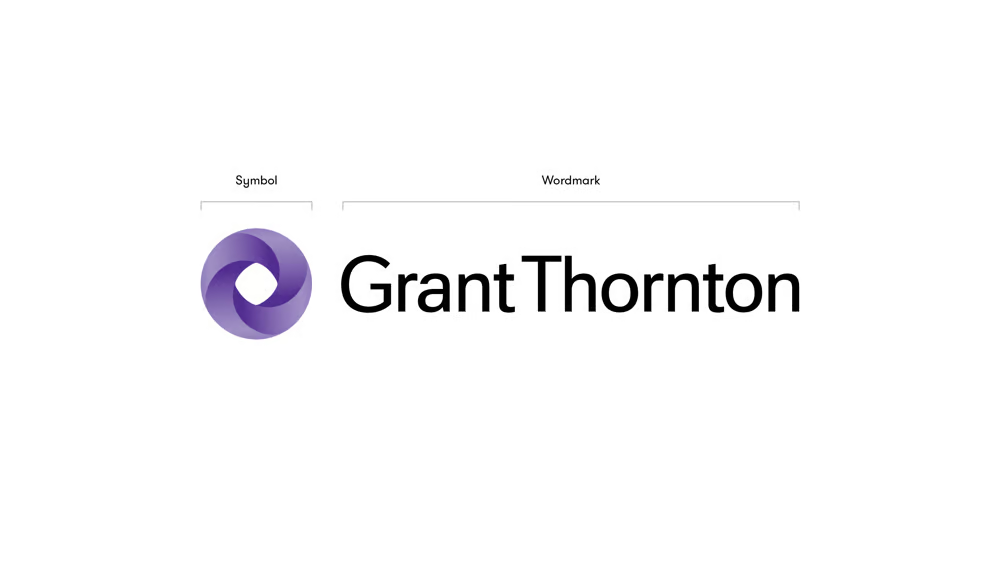
Our logo is at the heart of our visual identity. It should be present on all our branded communications, products and services. The symbol is the Mobius strip. It's interconnectedness represents us and our clients, and us and our people.

Full colour version
Full colour to be used across all communications with white or light background.
Negative and positive version
Negative logo to provide greater contrast on brand textures and dark backgrounds. Positive logo used to be complementary and less standout.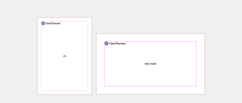
Positioning
In primary use-cases, the GT logo should always be positioned inside the top and left margins of a layout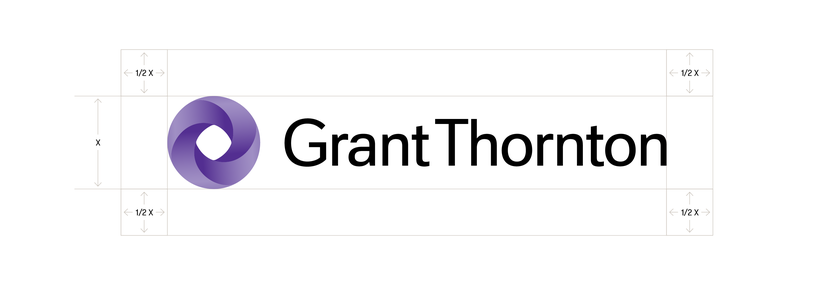
Clear space
To ensure brand impact and legibility, we have specified a clear space rule for logo usage.Color
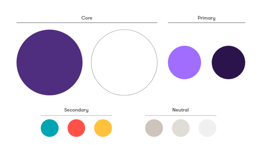
Our color palette consists of four groupings: Core, primary, secondary and neutral.

Colour values
In primary use-cases, the GT logo should always be positioned inside the top and left margins of a layout
Usage
To ensure brand impact and legibility, we have specified a clear space rule for logo usage.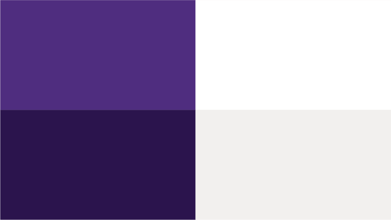
Accessibility
In primary use-cases, the GT logo should always be positioned inside the top and left margins of a layoutTypography
We use GT Walsheim, across all digital and marketing applications. This font is available in Light, Regular, Medium, Bold and Black weights. Follow the examples below for best practice usage.


Weights
This font is available in Light, Regular, Medium, Bold and Black weights.
Alignment
We typeset our layout either left aligned or centre aligned.
Leading
To aid consistency and legibility follow the leading example above.
Expression
We can express our typographic system in four seperate ways. Standard, emphasis, highlight and indent expressions allow us to tailor our voice to particular messages and audiences.Photography
Photography brings warmth and builds an emotional connection to our people, relationships, clients, communities and Go Beyond. To make sure our photography is on brand, we use three basic principles when sourcing imagery from stock libraries or when commissioning a photoshoot:

It is important our photography captures the essence of the people we encounter, from employees to clients and beyond. Follow the examples below to help convey the broader, human qualities of our brand and the communities we serve.

Core
Our core brand photography features people candidly interacting in a workplace environment. These images capture the essence of people we encounter, from employees to clients and beyond.

Industry
Our industry photography represents our diverse set of clients, the extent of industries we work with and our valued expertise in different industries.

Go Beyond
Our ‘Go Beyond’ category includes a variety of images either aspirational or industry related all with a common sense of direction. These images should not be people focused.
Grid and layout
Our layouts are built on a 12x12 grid, which allows us to create digital and print layouts in a varied but consistent way.
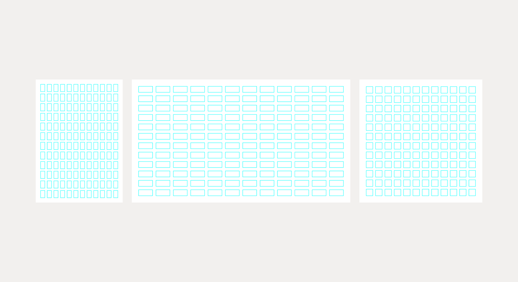
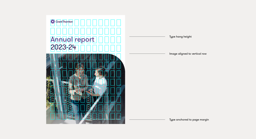
Using the grid
Our grid allows us place brand elements on consistent hang heights, producing a consistent and considered feel to layouts.
Holding shape
We can combine both text and imagery with the holding shape.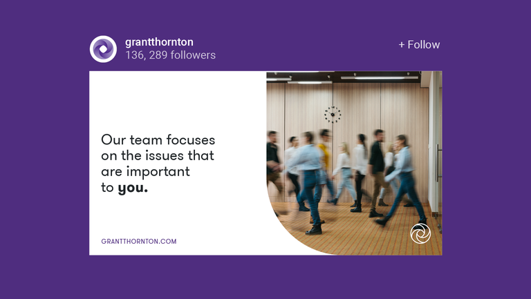
Cropped holding shape
The cropped holding shape is solely used as a image container.Graphic textures
Our graphic textures help us express moments of expansion, interconnecting and direction to further the idea of ‘Go Beyond’.
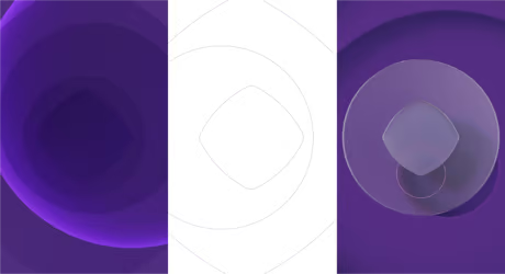
Texture versions
We can use three different variations of the textures, which allows for flexibility for the content we create and gives us the ability to tell our story in multiple ways.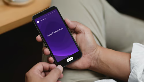
Graphic
The graphic textures range in expression and flexibility allowing for both subtle and expressive usage throughout the brand.
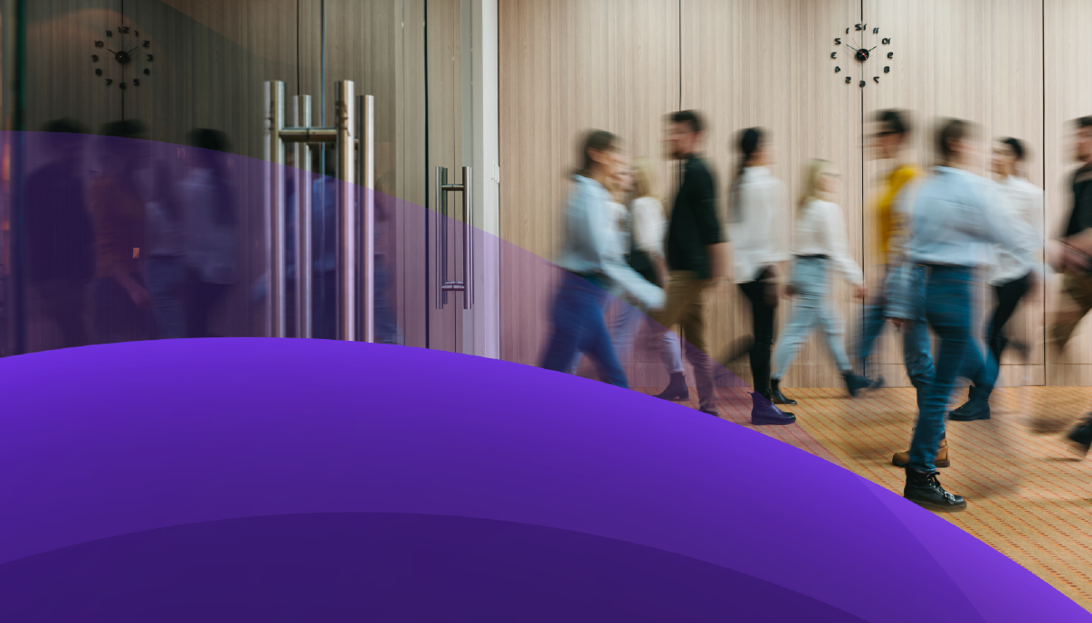
Keyline
Keyline textures offer calmer communications which allows messaging or photography to be the focus point.Dimensional
Dimensional textures offer a visually rich and impactful backdrop for when we want a bold brand statement. Therefore, these are to be used sparingly for hero applications in print and digital.Photography treatment
Our treatment styles are complementary to our brand images. They can support content, help create interest and allow the brand to easily own imagery.

Graphic
The graphic treatment is available in three styles, solid graphic, overlay graphic and subtle overlay graphic.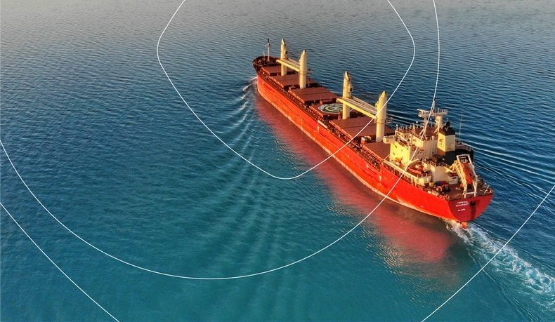
Keyline
Keyline treatments are applied over images to create interest and allow the brand to easily own imagery, in a subtle and recessive style.
Holding type
Solid graphic treatment can create clear space in communications to hold typography.Iconography
Iconography is figurative, functional and informative, conveying ideas rather than abstract, illustrated forms. Icons can have multiple meanings for use in different contexts in our brand.

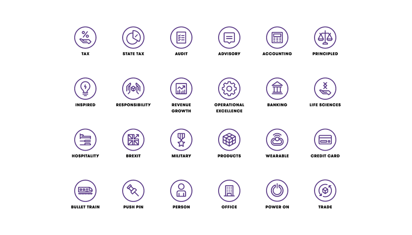
Subject matter
Iconography is figurative, functional and informative, conveying ideas rather than abstract, illustrated forms. Icons can have multiple meanings for use in different contexts.
Solid colour
The icons are availble in all core, primary and secondary colours.